[Case Studies] Flip Flip: What Children Believe 2019
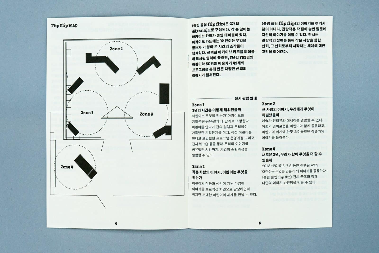
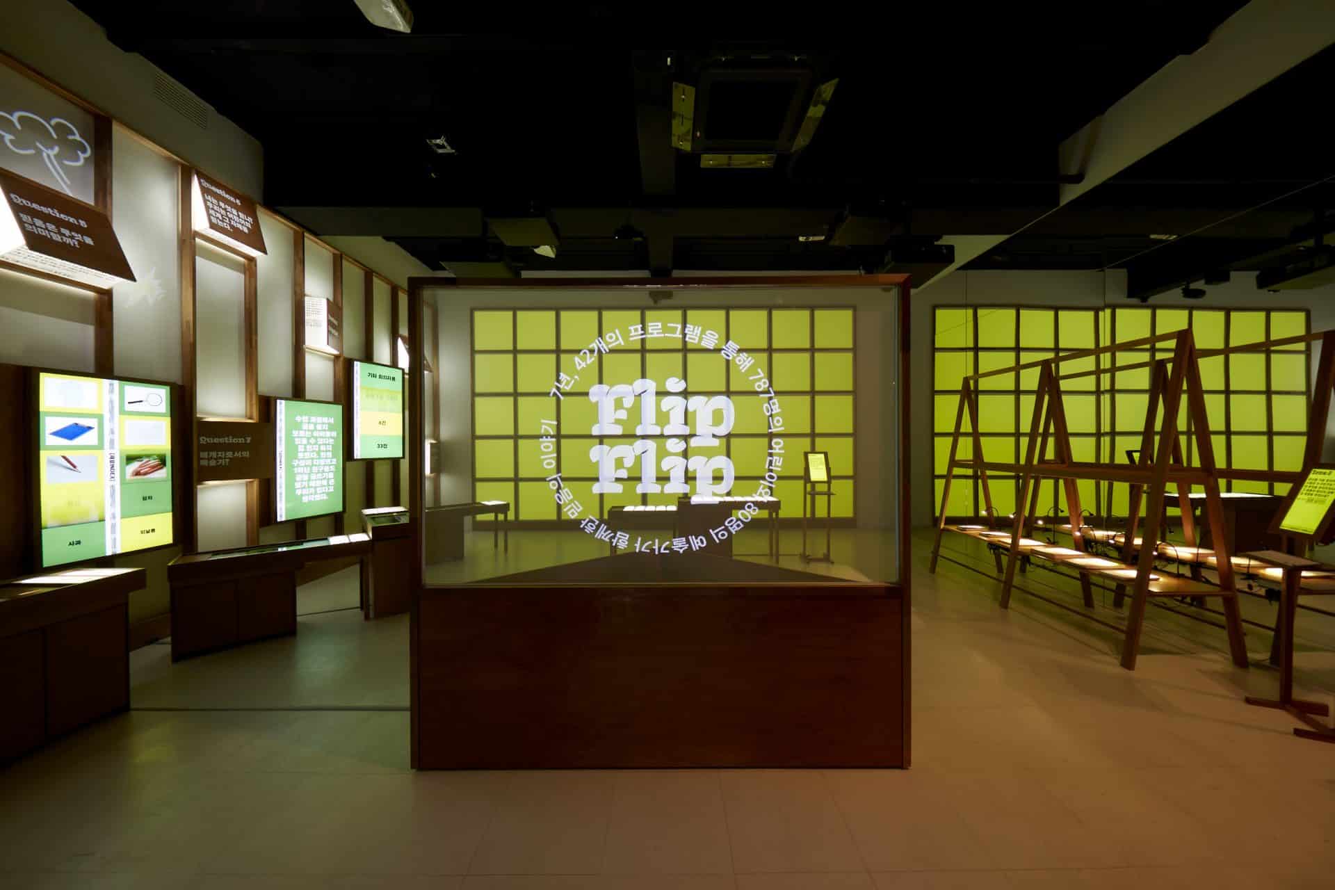
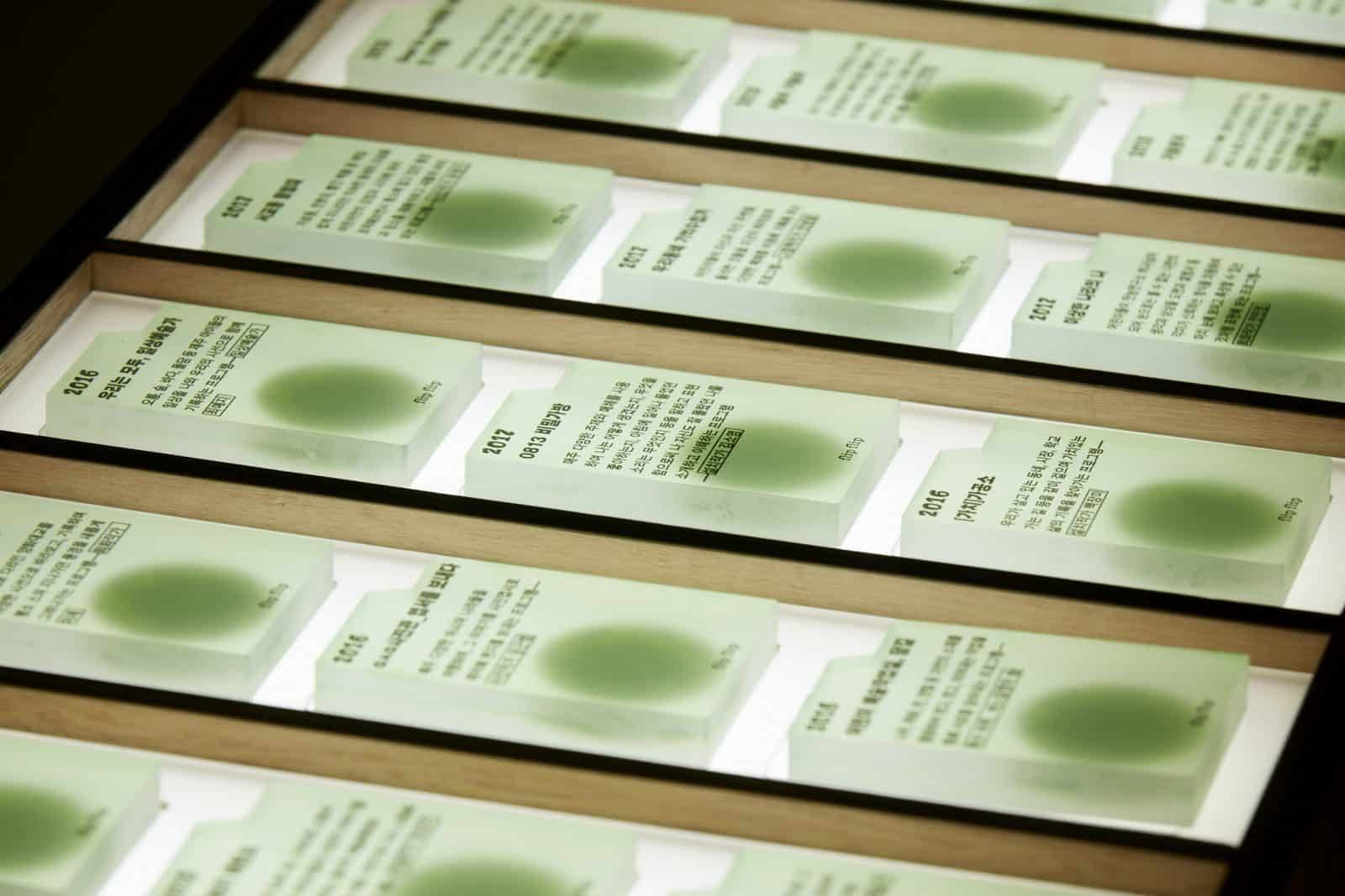
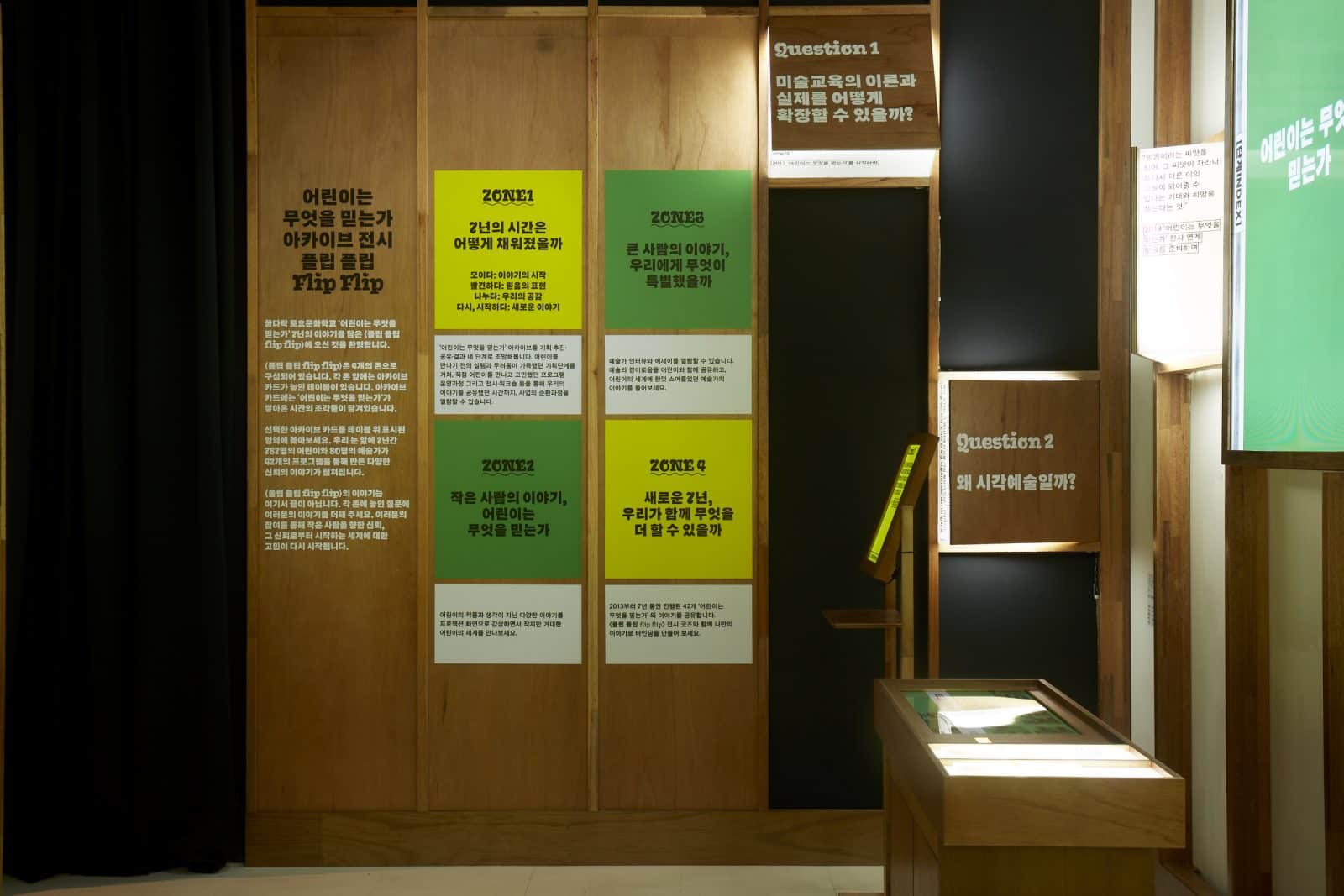
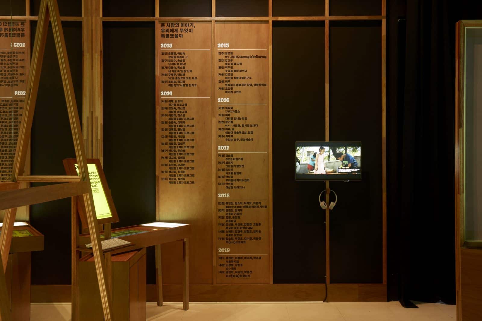
What Children Believe is a project hosted by the Korea Arts & Culture Education Service for seven years from 2012 to 2019 with artists and children. In particular, What Children Believe in this exhibition title, Flip Flip, is a collection of seven years’ records that people haven’t shown or haven’t shown before. The exhibition explores the 42 programs of 787 children, 80 artists, and brings forward the numerous questions, thinkings and efforts behind the course.
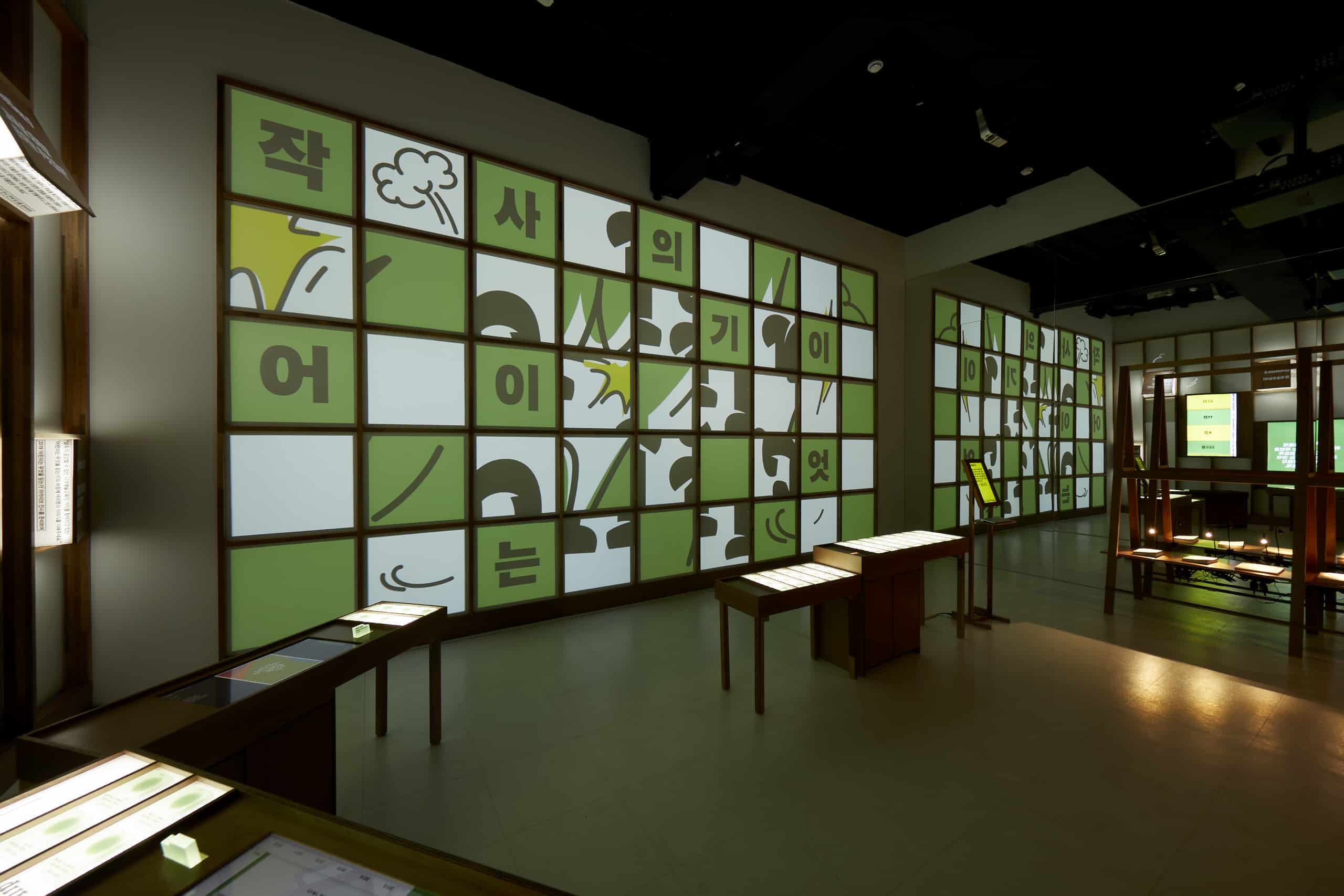
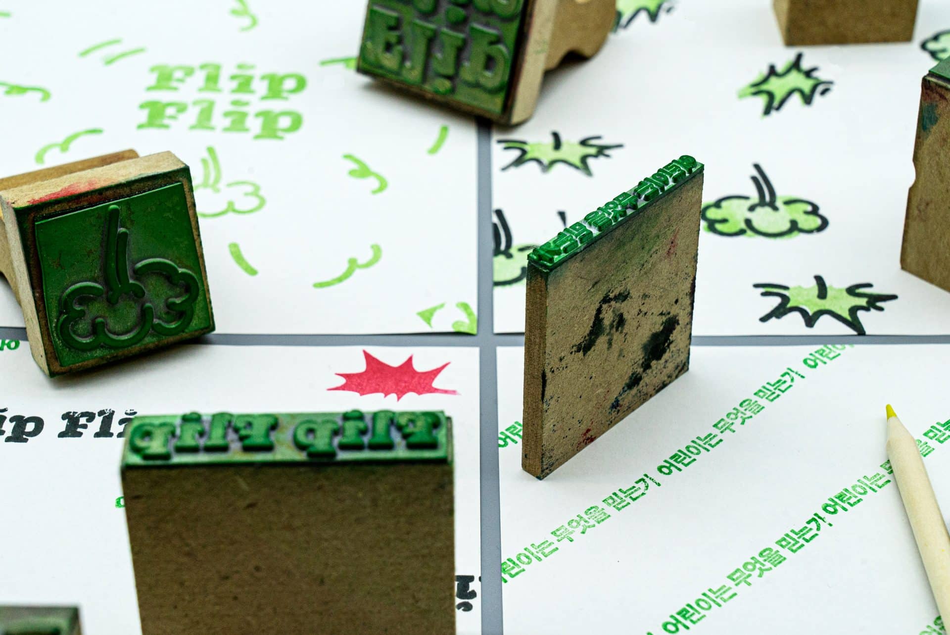
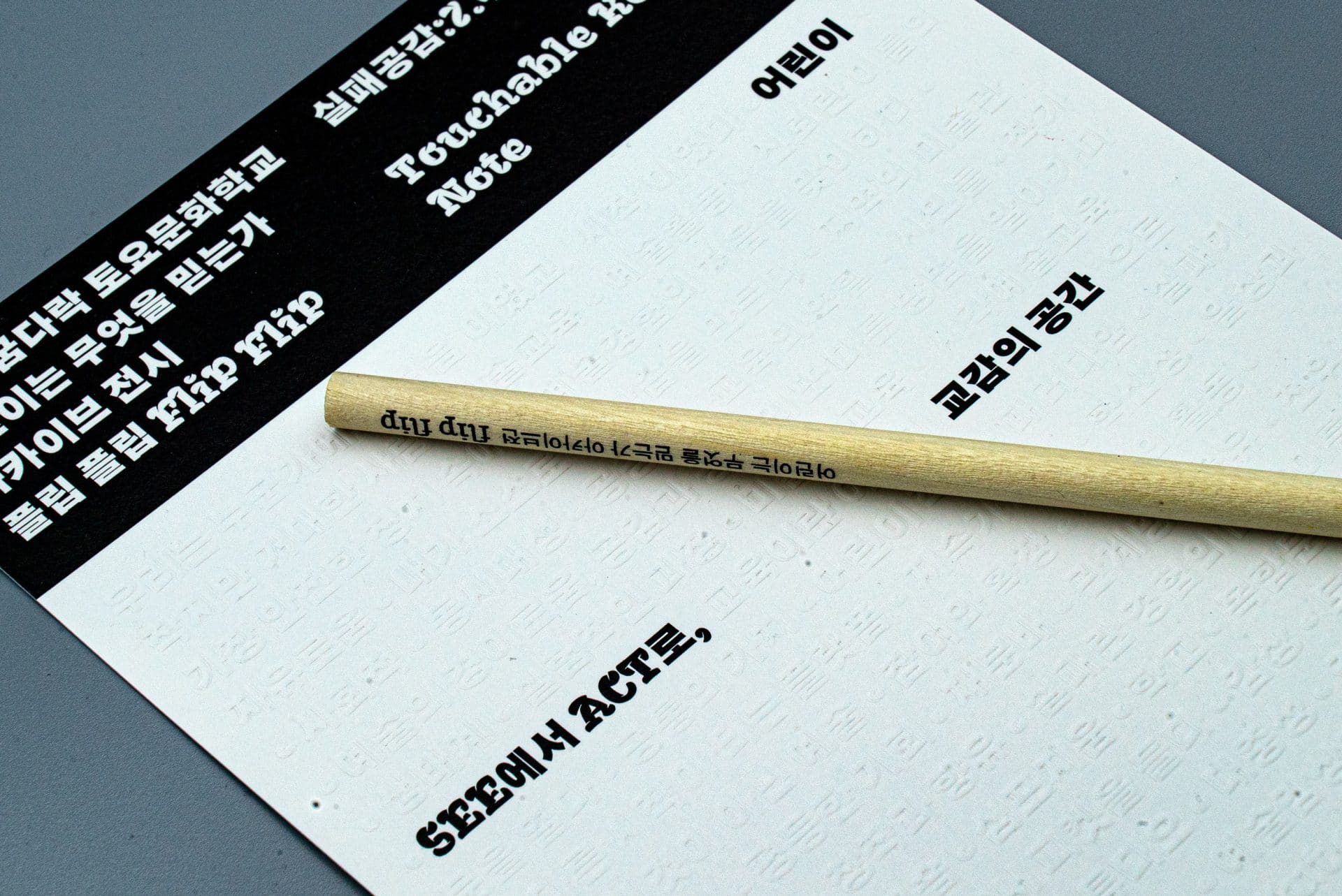
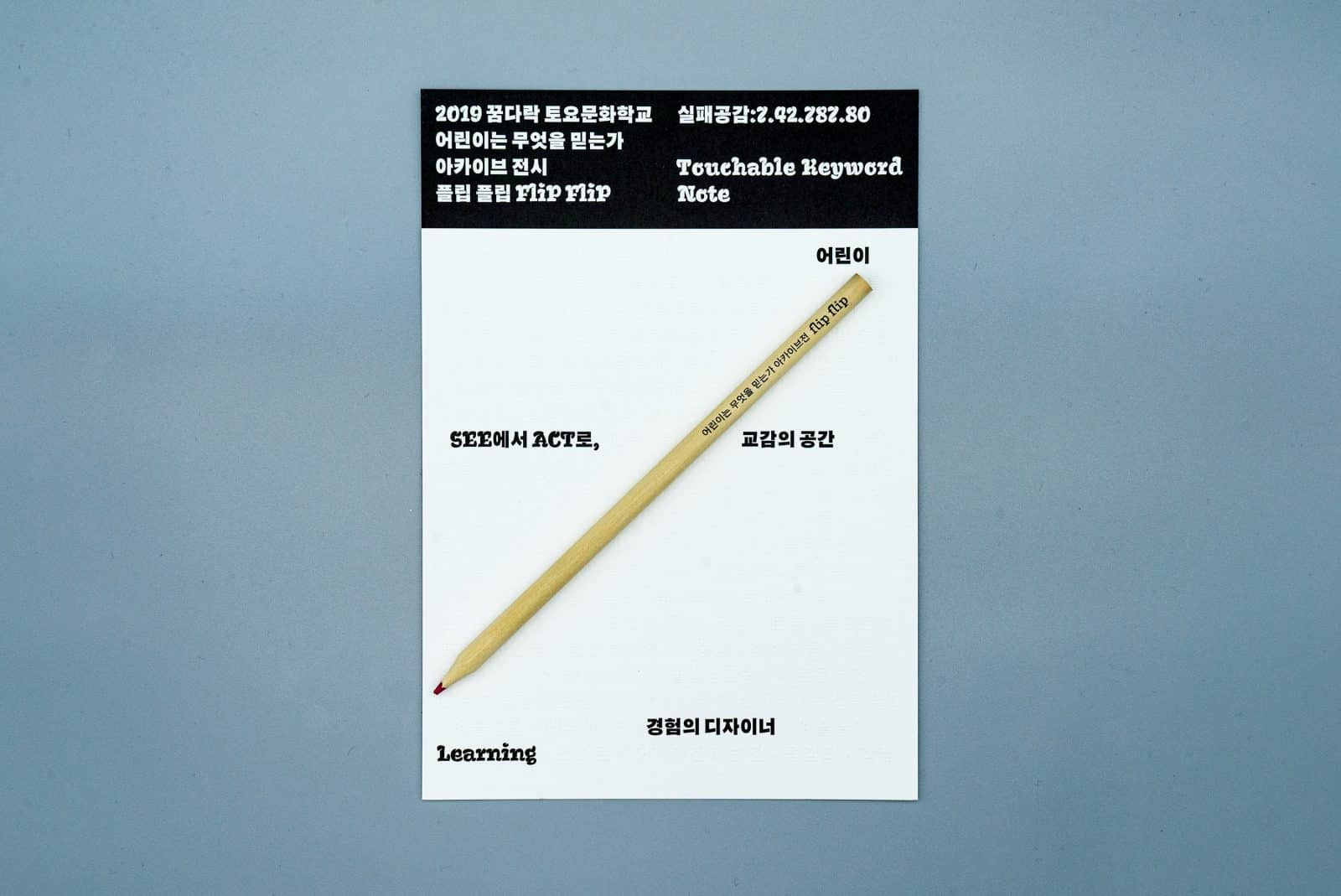
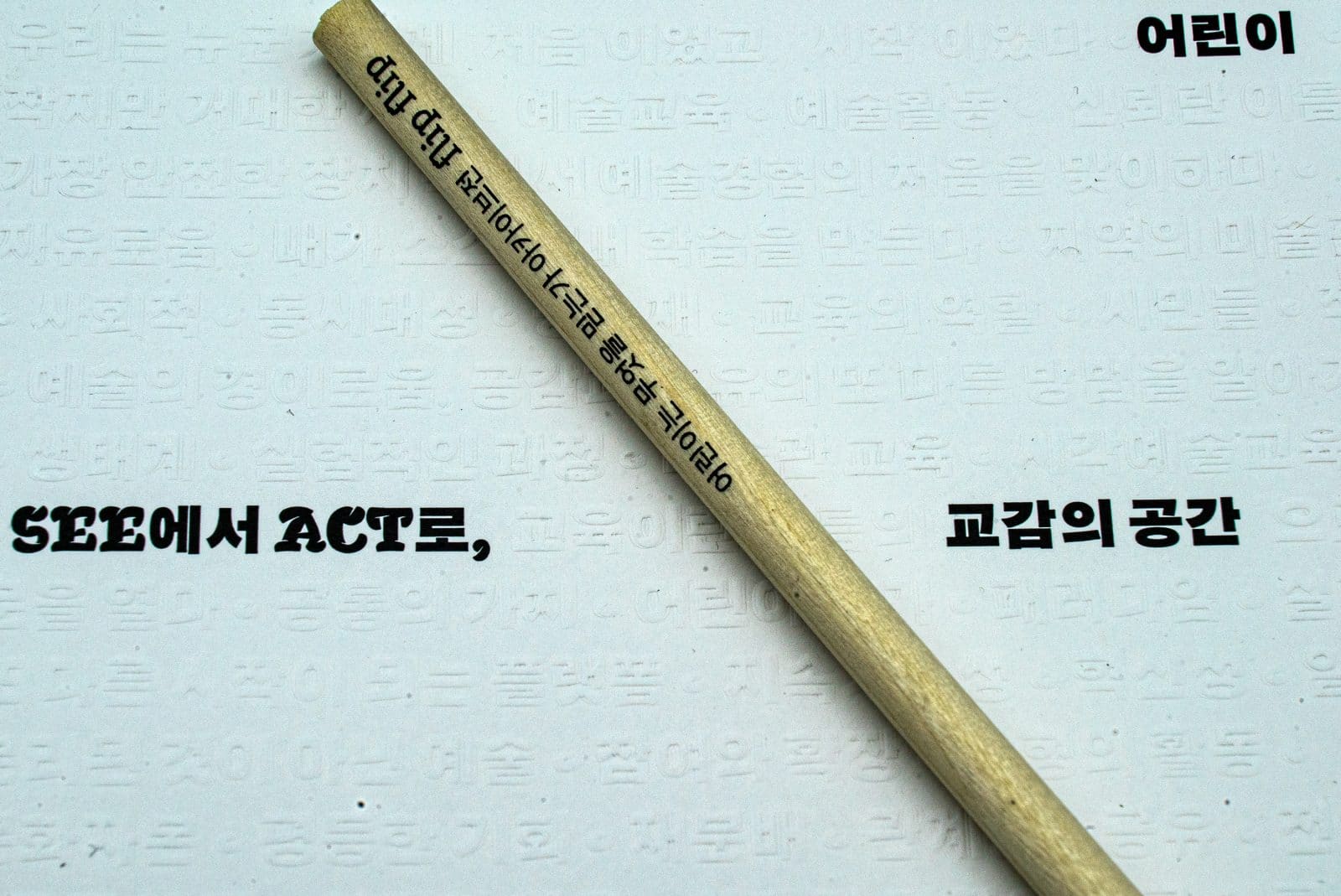
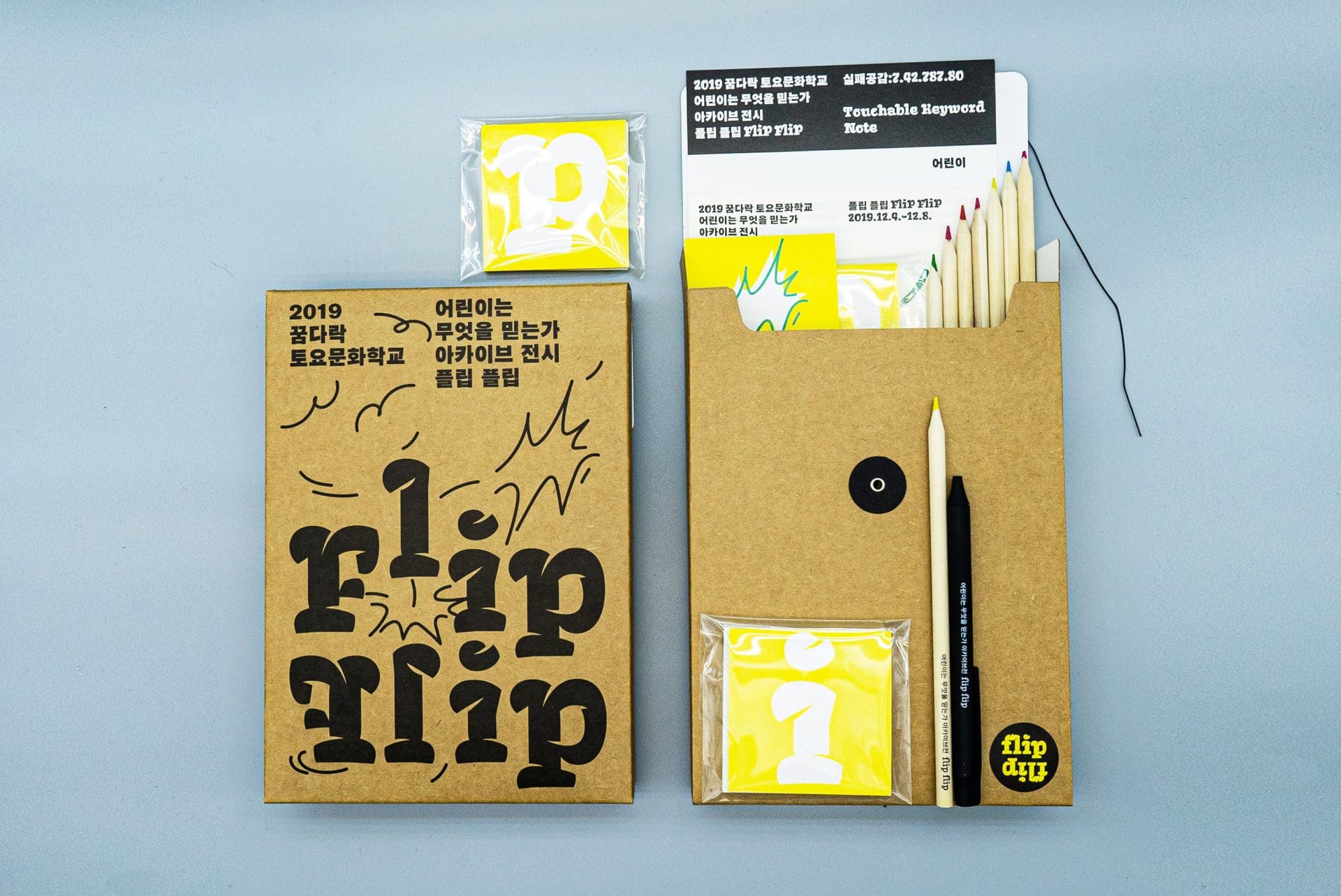
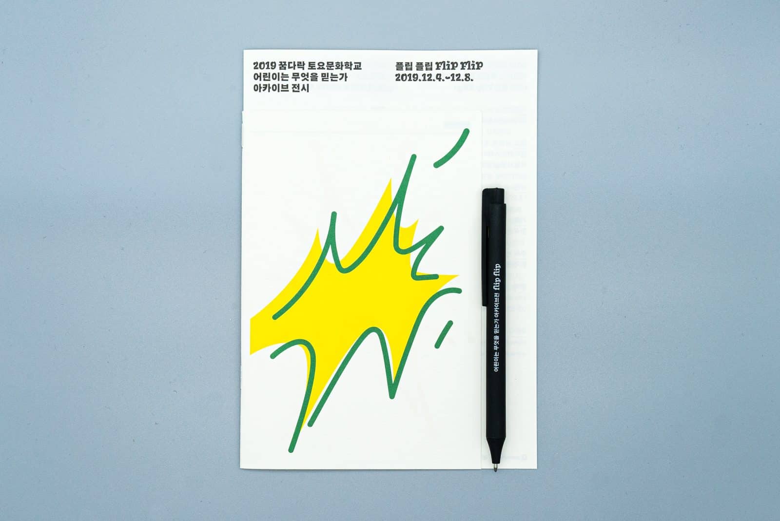
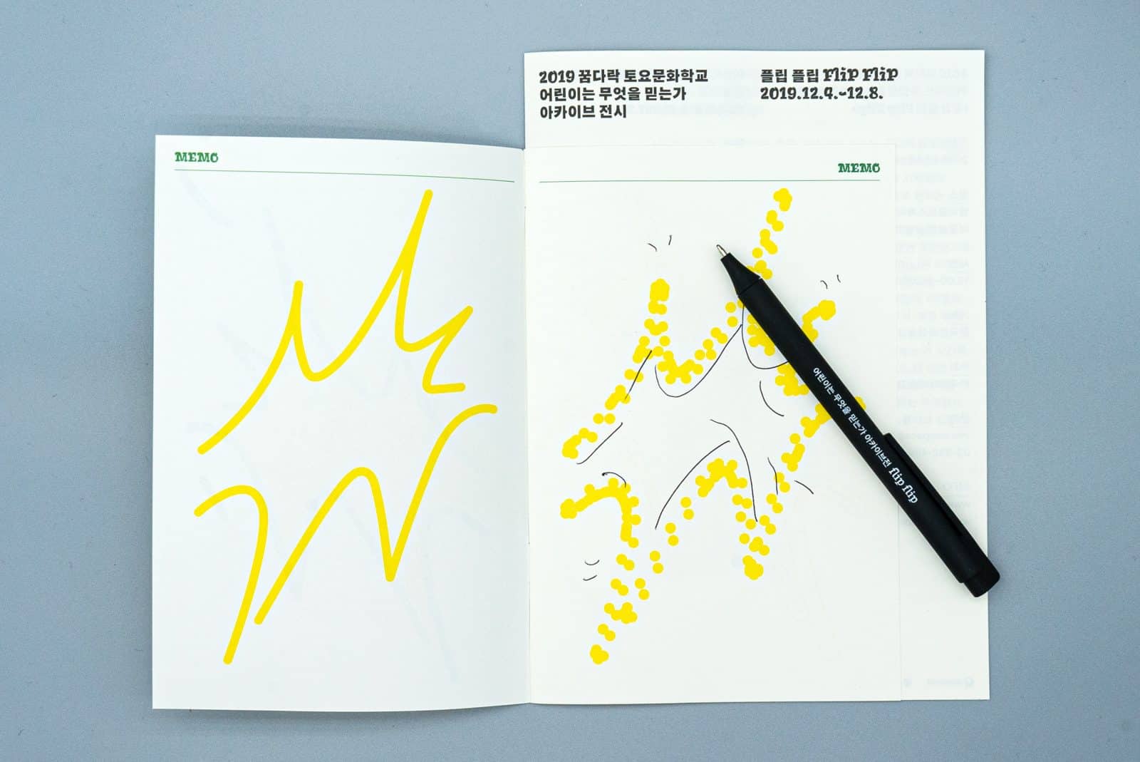
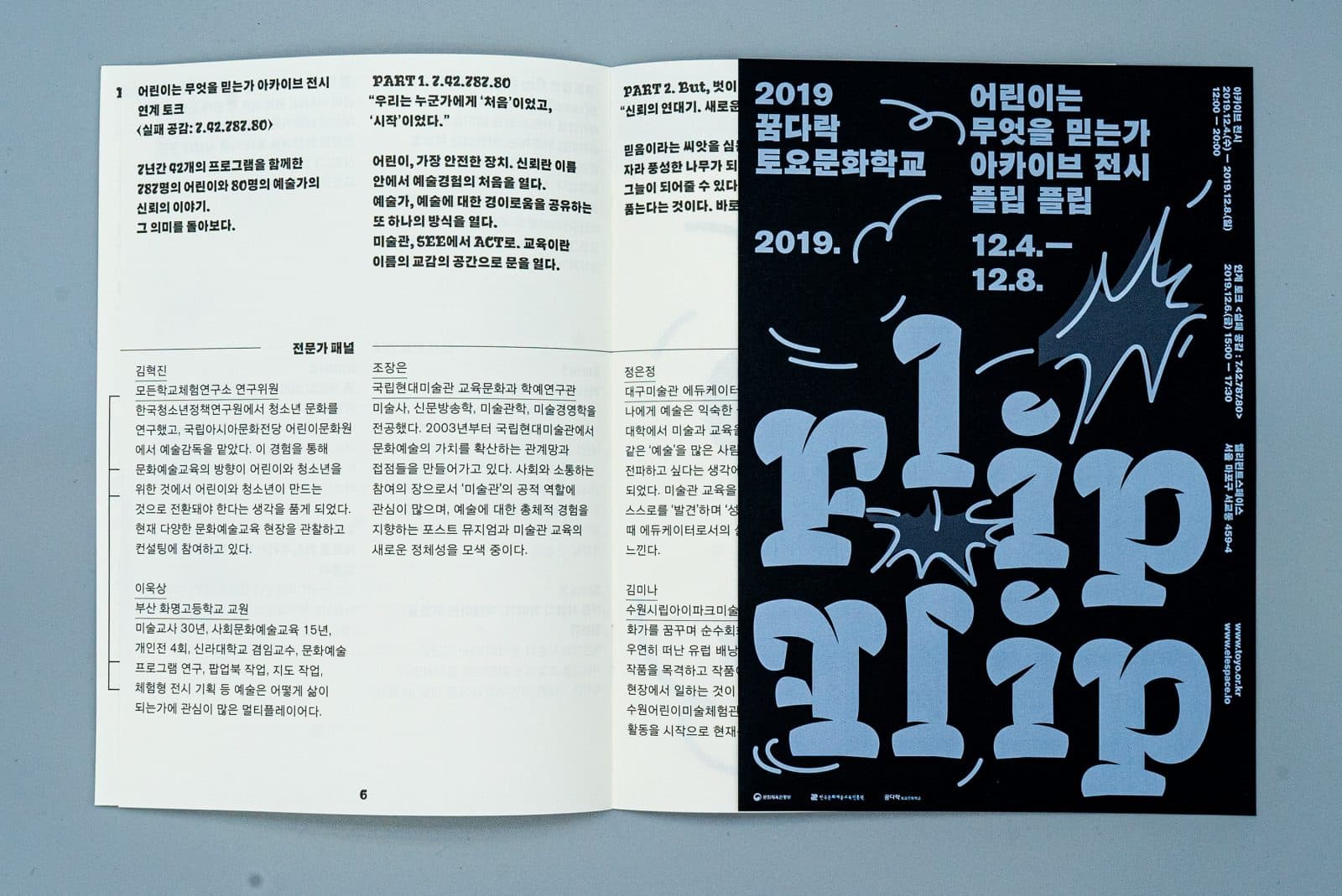
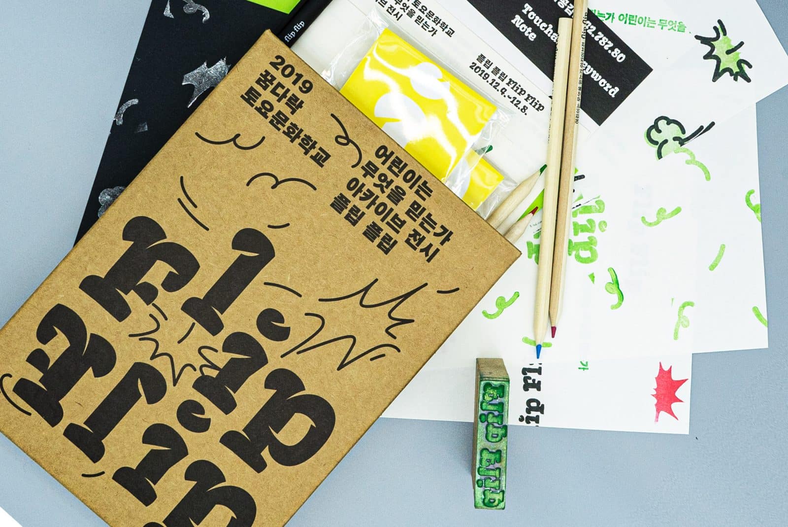
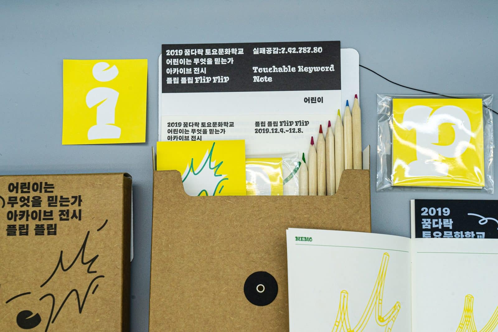
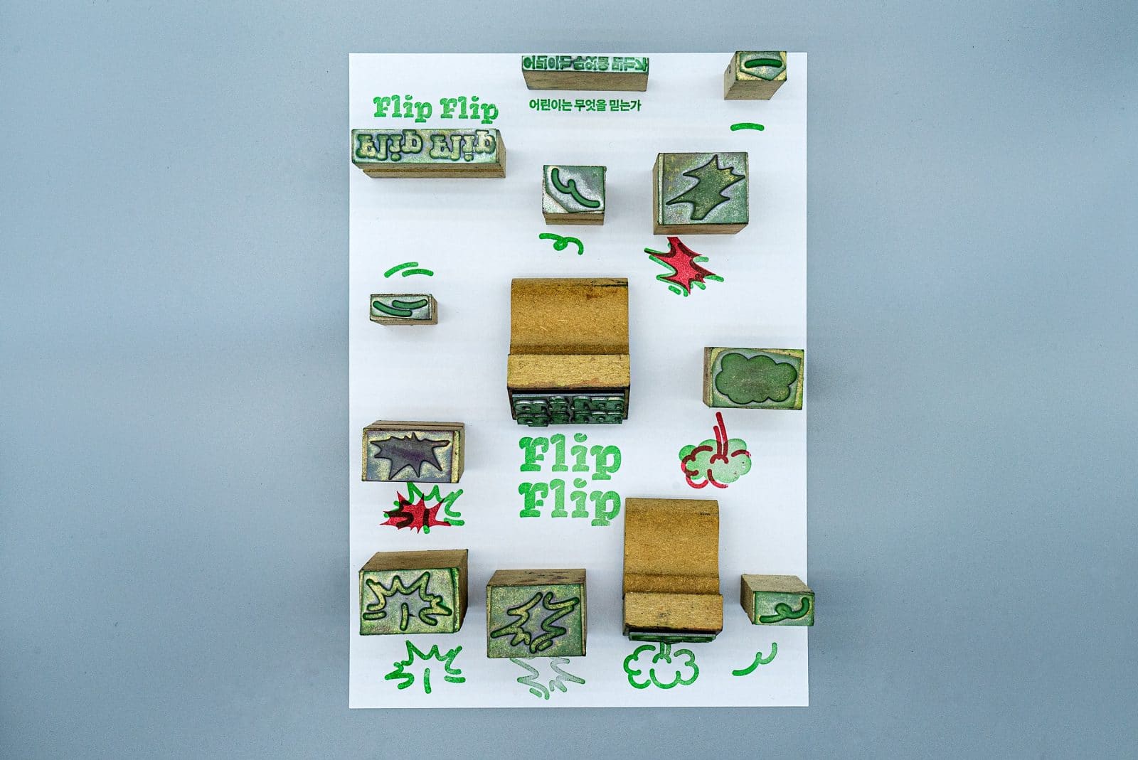
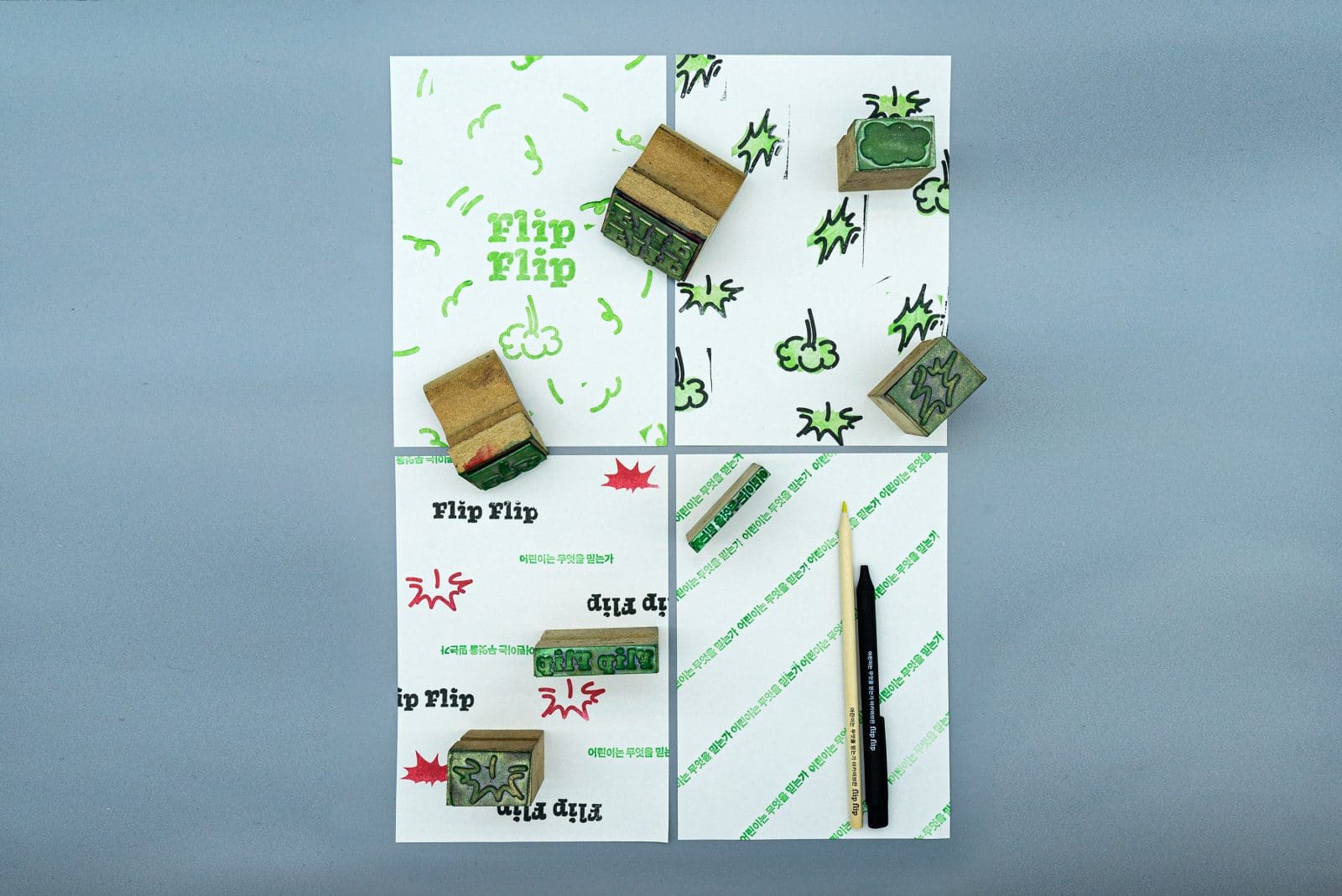
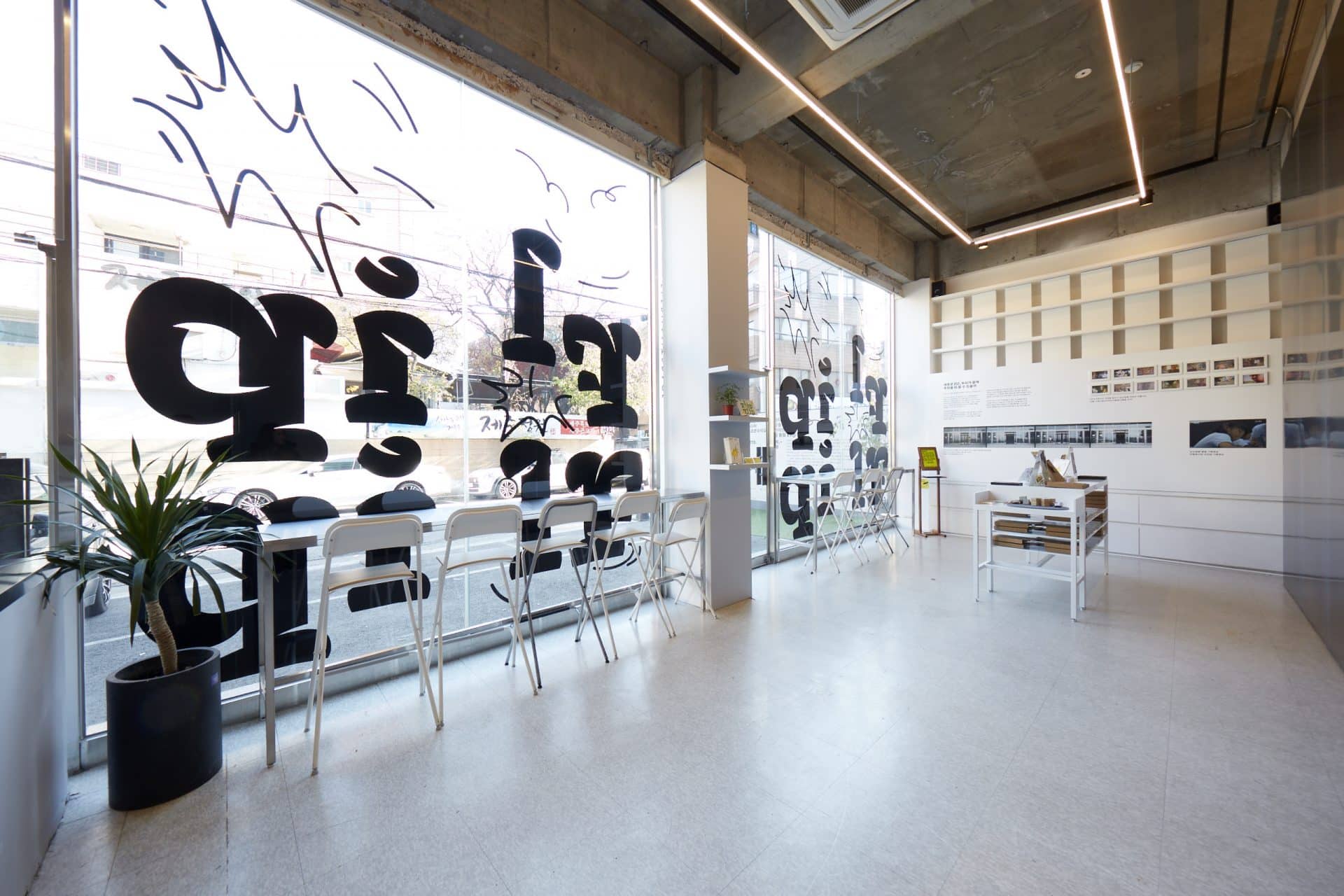
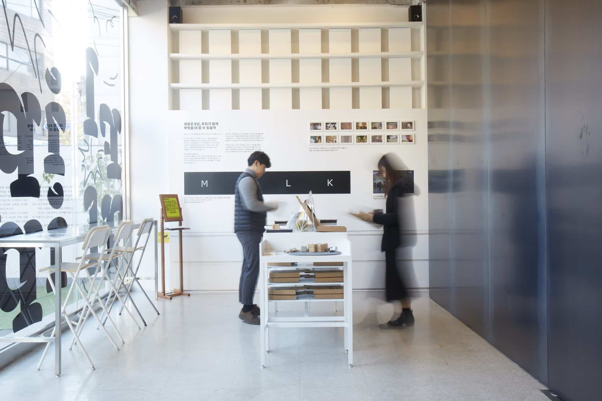
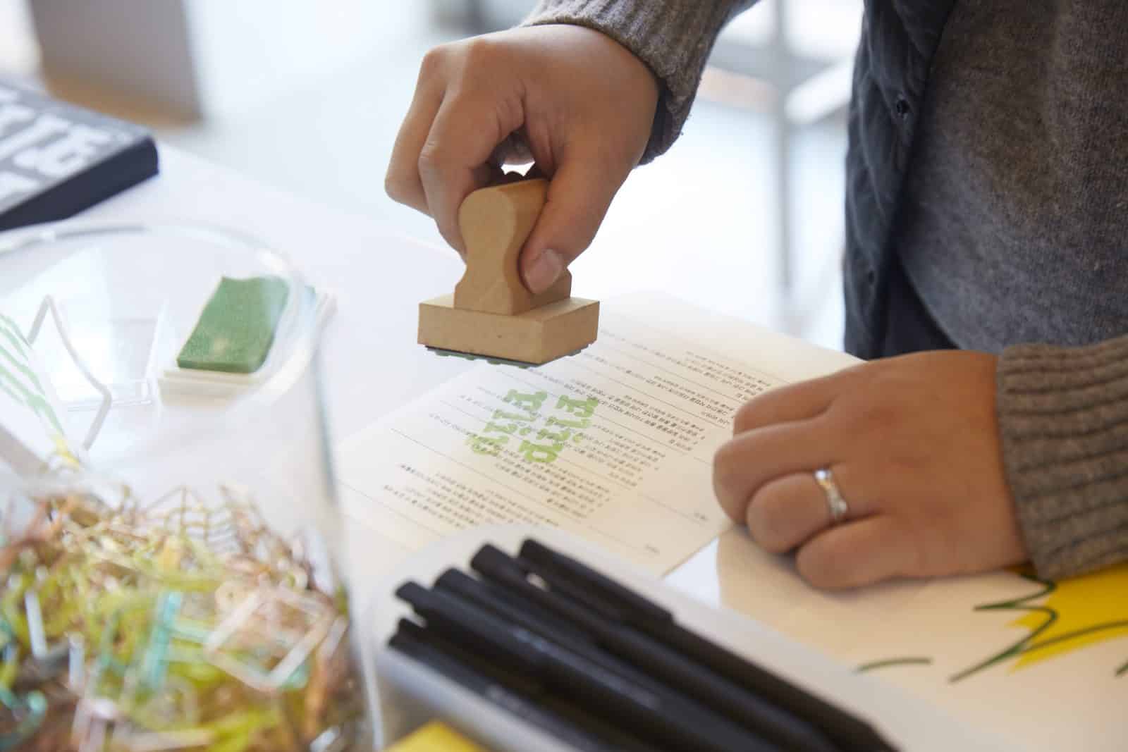
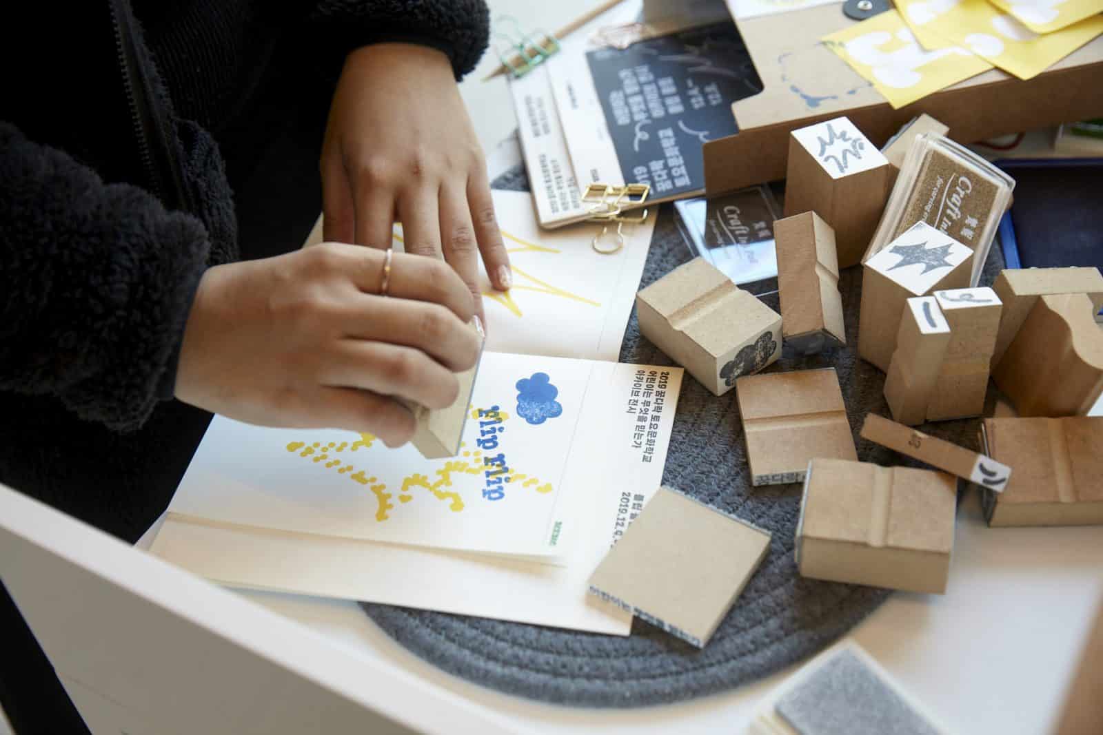
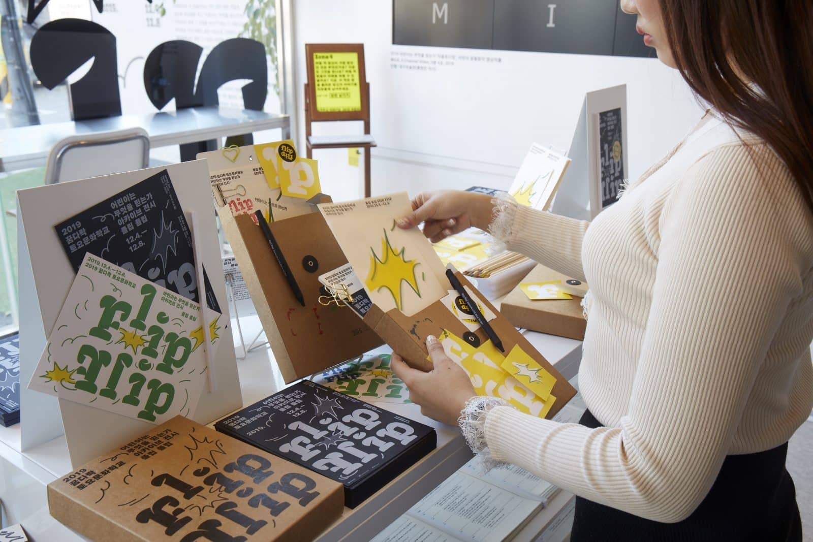
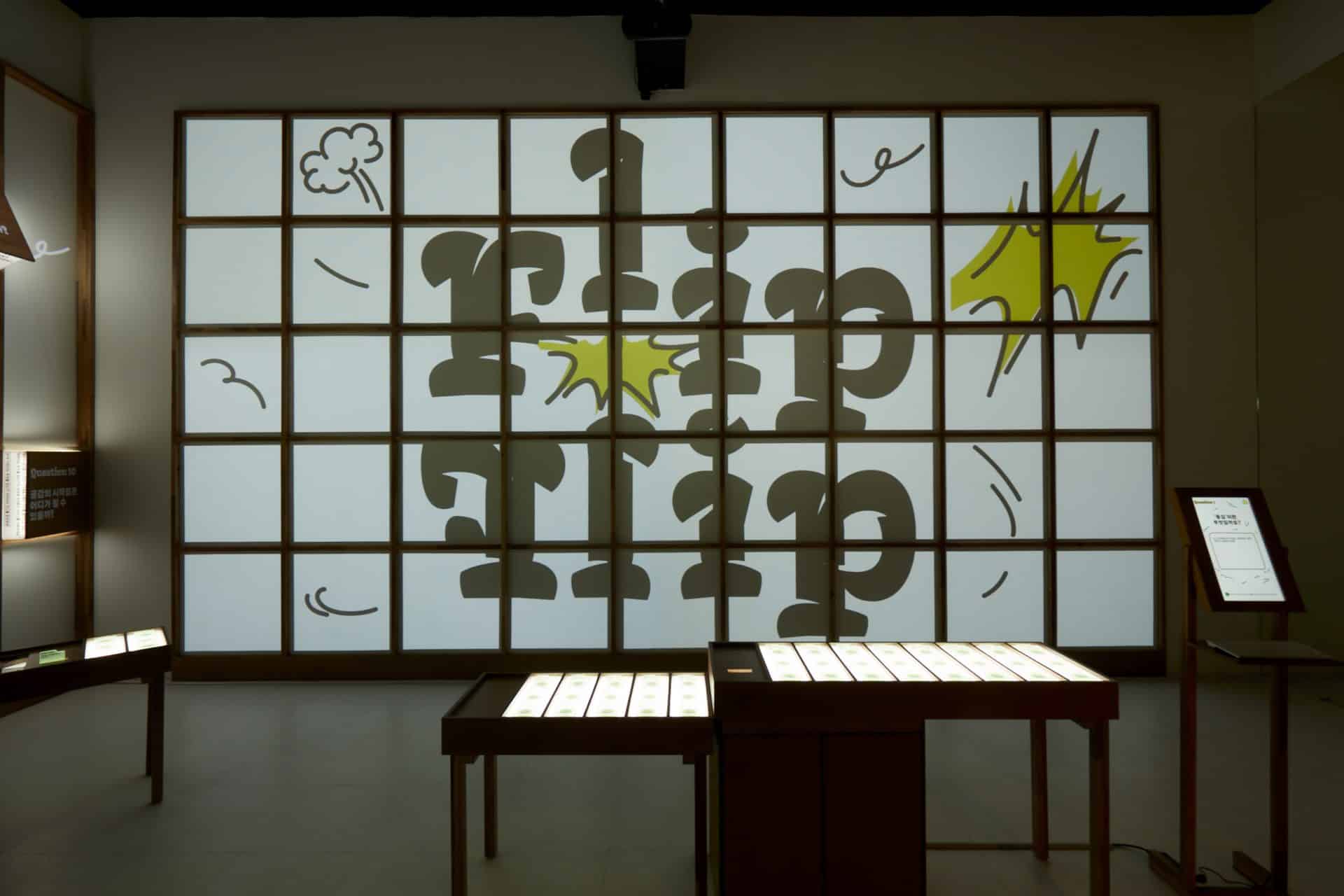
We considered the graphics of the exhibition in two ways. First of all, it is the exhibition identity design. For the past six years, this project exhibition has shown the main logo on the front page and has changed color every year. But, we design a new graphic instead of using an easy way to get this main logo back on. We chose a title typeface that can be visually appealing and mingled with the title Hangul. This typeface also had the advantage of continuing the cheerful tone of the exhibition. We also adjust the line thickness, line-to-space ratio around the typeface so that the hearing and tactile elements can be simultaneously associated with the typeface as the voices of these types are amplified. And then we modularized it all to create a logic for the exhibition graphics. Each graphic element, including the typeface, was made of stamps, notes, pencils, binding boxes, etc. That allowed visitors to capture the design during the exhibition period.
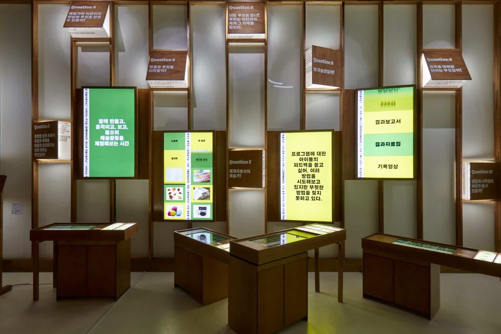
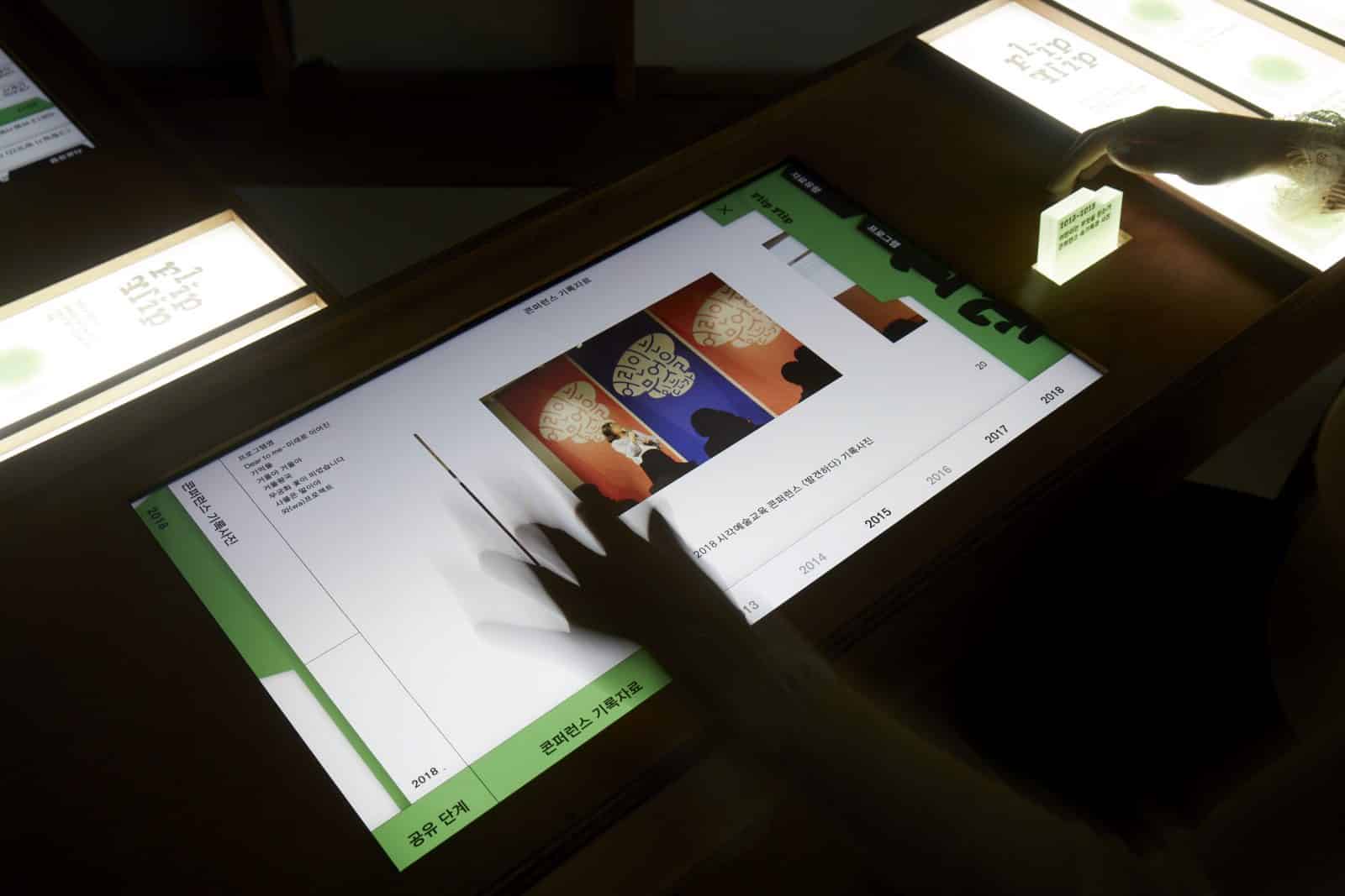
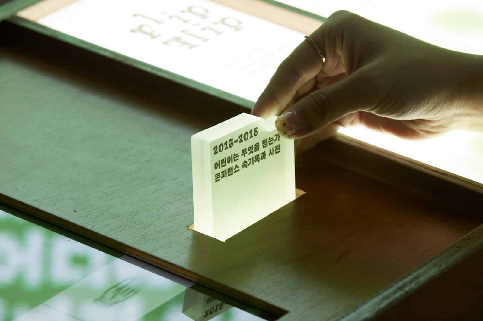
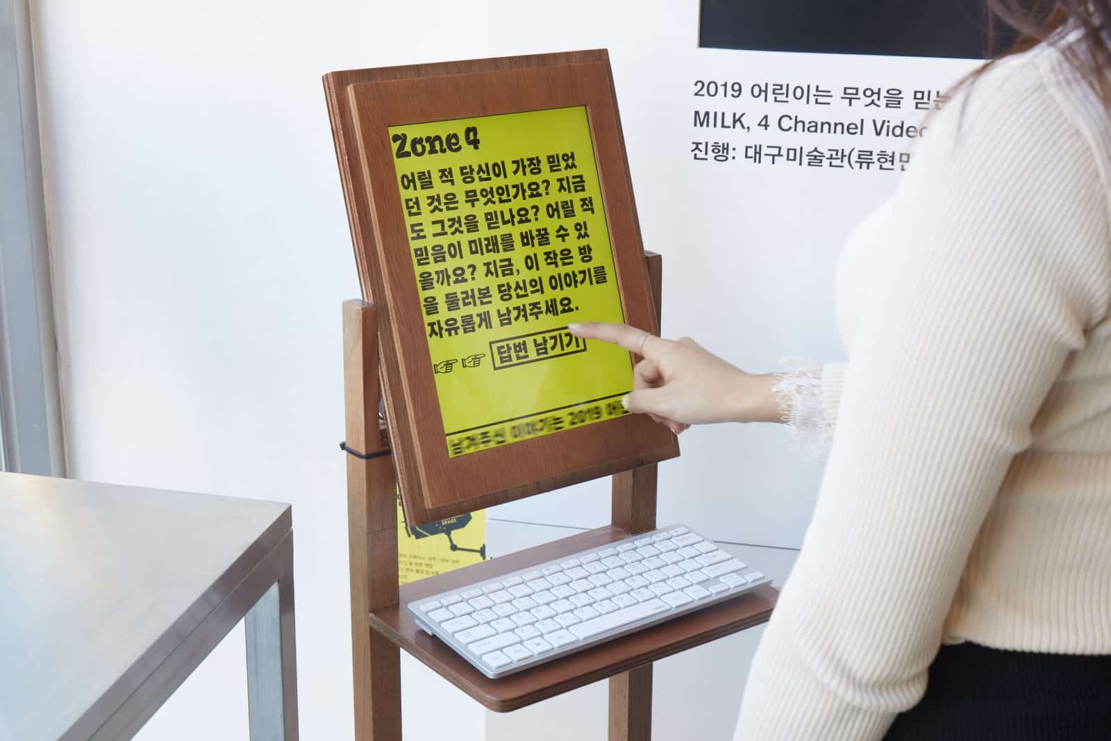
And because the archives that children and artists have made over the last seven years have been archived in different forms, depending on time, space, and subject matter, we wanted to have large volumes of data delivered in a coherent tone. So we did the project by modularizing typography styles and using a variety of printed materials and web-inclusive digital media with previously developed exhibition graphics systems.

 KR
KR